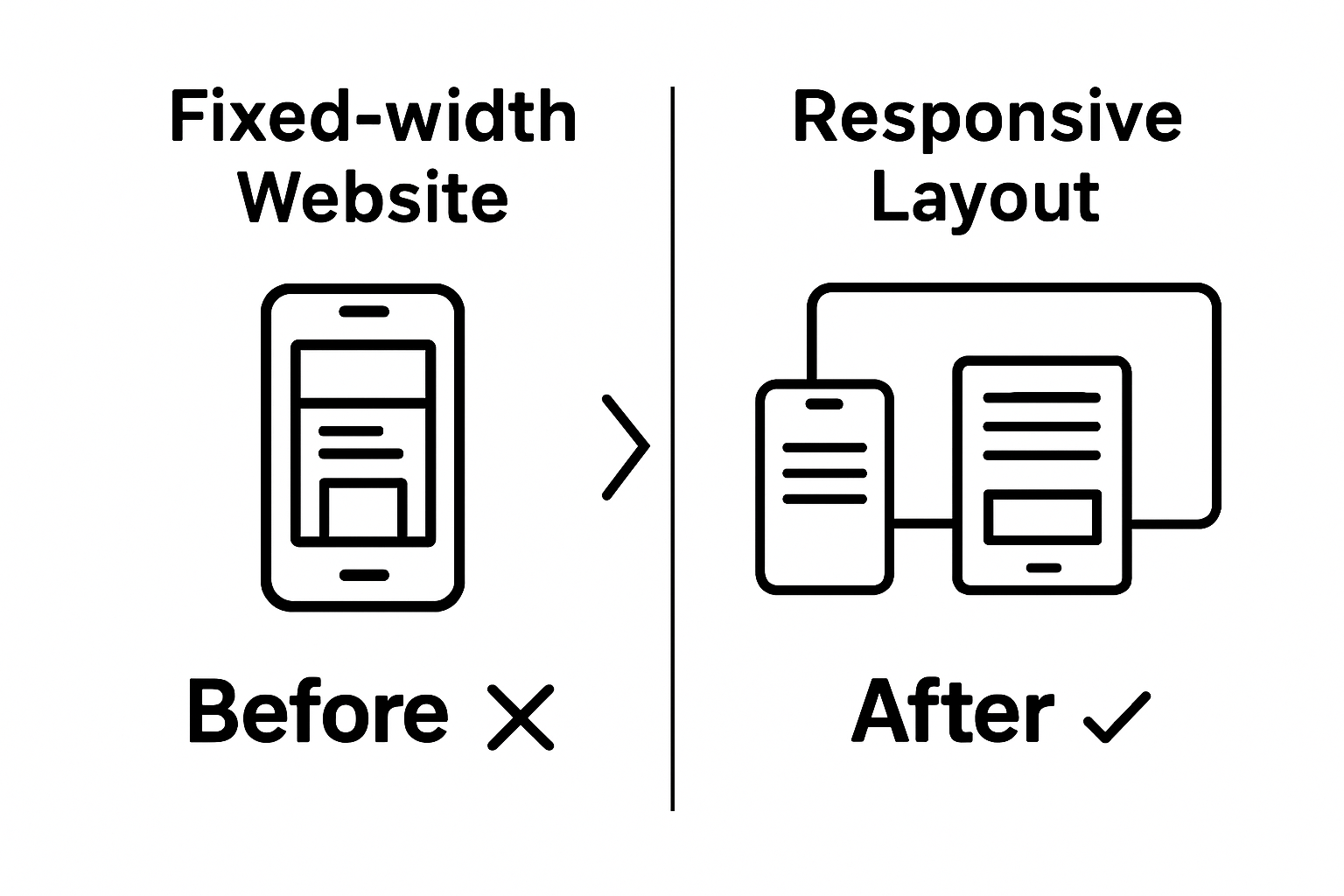
Master Responsive Website Design for Your Business Success
Building a website that looks perfect on every screen is no longer a luxury. Studies reveal that over 60 percent of all web traffic now comes from mobile devices , yet most small businesses still struggle with clunky layouts and hidden menus. What surprises most business owners is that creating a seamless site experience often starts with a single overlooked step: understanding how your site currently behaves on real devices—not just how it appears on your laptop.
Table of Contents
Quick Summary
| Key Point | Explanation |
|---|---|
| 1. Assess current website layout | Review your website on different devices to identify readability and navigation issues. Document elements needing improvement for actionable changes. |
| 2. Research responsive design principles | Understand fluid grids and media queries that allow layout adjustments based on screen size. Analyze industry leaders for effective strategies. |
| 3. Choose a mobile-friendly framework | Select frameworks like Bootstrap or Tailwind CSS that align with your needs, providing essential tools for responsive design efficiency. |
| 4. Implement fluid grids and flexible images | Use percentage-based sizes and CSS properties to ensure your layout and images adapt well on all devices without distortion. |
| 5. Test across multiple devices | Conduct thorough testing on various devices and browsers to ensure consistent performance and a smooth user experience. |
Step 1: Assess Your Current Website Layout
Understanding your current website layout is the critical first step toward creating a responsive design that attracts and retains customers. This initial assessment provides the foundation for transforming your digital presence and ensuring your website performs optimally across all devices.
Begin by conducting a comprehensive review of your existing website. Open your site on multiple devices – desktop computers, tablets, and smartphones – and critically examine how your content shifts and adapts. Pay close attention to text readability, image scaling, and navigation menu functionality . A responsive website must maintain clarity and usability regardless of screen size.
Utilize free online tools like Google’s Mobile-Friendly Test to evaluate your current layout’s responsiveness. These diagnostic tools provide immediate insights into potential design weaknesses. Look for specific indicators such as text that becomes too small to read, images that don’t resize correctly, or navigation menus that collapse awkwardly on smaller screens.
Documenting your findings is crucial. Create a detailed inventory of design elements that require improvement. Note specific challenges like overlapping text, horizontally scrolling content, or buttons that are too small to tap comfortably on mobile devices. This systematic approach transforms your assessment from a general overview into an actionable roadmap for responsive design enhancement.
Key verification criteria for a successful initial assessment include:
- Content remains legible across all device types
- Navigation elements function smoothly on mobile and desktop
- Images and multimedia scale proportionally without losing quality
- No horizontal scrolling is required on mobile devices
Learn more about effective website design strategies to complement your responsive design journey. By meticulously examining your current website layout, you’re laying the groundwork for a digital presence that not only looks professional but also delivers an exceptional user experience across every potential customer’s device.
Step 2: Research Responsive Design Principles
Diving deep into responsive design principles transforms your website from a static digital brochure into a dynamic, adaptive platform that engages users across all devices. This research phase is crucial for understanding the technical and strategic elements that create seamless user experiences.
Responsive design centers on three fundamental technical approaches : fluid grids, flexible images, and intelligent media queries. These principles allow your website to dynamically adjust its layout and content presentation based on the specific device screen size. Start by studying how successful websites in your industry implement these techniques. Examine their navigation structures, how content reflows, and how visual elements scale proportionally across different screen dimensions.
Explore industry-standard resources like Mozilla Developer Network to understand the technical foundations of responsive design. Focus on learning CSS techniques that enable responsive layouts, such as using percentage-based widths instead of fixed pixel measurements. Understand how media queries work to detect screen sizes and apply specific style rules , which is the backbone of creating a truly adaptive website design.
Practical research involves hands-on exploration. Use browser developer tools to simulate different device screen sizes and observe how websites adapt. Chrome and Firefox offer excellent built-in device emulation features that allow you to see how your design might look on smartphones, tablets, and desktop computers. Take detailed notes on layout changes, readability, and user interaction challenges.
Your responsive design research verification checklist includes:
- Comprehension of fluid grid concepts
- Understanding media query implementation
- Identification of responsive design techniques used by industry leaders
- Practical experience manipulating website layouts using developer tools
Learn more about advanced web design strategies to complement your responsive design knowledge. By thoroughly researching these principles, you’re building a solid foundation for creating a website that looks exceptional and functions flawlessly across every potential customer’s device.
Step 3: Choose a Mobile-Friendly Framework
Selecting the right mobile-friendly framework is a pivotal decision that will determine the effectiveness and efficiency of your responsive website design. This crucial step transforms your research and planning into a tangible development strategy that ensures your website performs seamlessly across all devices.
Modern web development frameworks provide pre-built solutions that dramatically simplify the responsive design process . Bootstrap, Foundation, and Tailwind CSS represent some of the most powerful and widely-used frameworks available to business owners. Each framework offers unique advantages, so your selection should align closely with your specific business needs, technical capabilities, and design requirements.
Carefully evaluate each framework’s core strengths and limitations. Bootstrap, for instance, provides extensive pre-built components and a grid system that makes responsive design relatively straightforward for developers with varying skill levels. Tailwind CSS offers more granular control and flexibility, allowing for highly customized designs. Consider your team’s technical expertise, project complexity, and long-term maintenance requirements when making this critical decision.
Below is a comparison table summarizing popular mobile-friendly frameworks mentioned in the article to help you quickly differentiate their main features and strengths.
| Framework | Key Features | Ease of Use | Customizability |
|---|---|---|---|
| Bootstrap | Pre-built components, grid system | Beginner-friendly | Moderate customization |
| Foundation | Flexible layouts, enterprise-friendly | Moderate difficulty | High customization potential |
| Tailwind CSS | Utility-first, granular control | Moderate difficulty | Highly customizable |
Practical framework selection involves hands-on exploration and testing. Download and experiment with sample templates, review documentation, and assess community support. Look beyond surface-level aesthetics and examine each framework’s performance metrics, compatibility with your existing technology stack, and update frequency . Some frameworks offer more robust mobile optimization features than others, so thorough investigation is key to making an informed choice.
Your framework selection verification checklist includes:
- Compatibility with your current web development infrastructure
- Comprehensive mobile responsiveness features
- Active community support and regular updates
- Alignment with your design and functionality requirements
- Ease of implementation and learning curve
Explore advanced web design strategies to complement your framework selection process. By meticulously choosing a mobile-friendly framework, you’re establishing a robust technological foundation that will support your business’s digital presence and deliver exceptional user experiences across all devices.

Step 4: Implement Fluid Grids and Flexible Images
Implementing fluid grids and flexible images represents the technical heart of responsive website design, transforming static layouts into dynamic, adaptable digital experiences. This critical step ensures your website looks professional and functions seamlessly across smartphones, tablets, and desktop computers.
Fluid grids replace traditional fixed-width layouts with proportional sizing , allowing content to resize and reposition intelligently based on screen dimensions. Begin by converting your existing pixel-based measurements to percentage-based calculations. For example, instead of defining a div as 800 pixels wide, calculate its width as a percentage of the total screen space. This approach enables your website’s layout to stretch and contract naturally, maintaining visual harmony across different devices.
Flexible images require careful technical implementation. Use CSS max-width properties to ensure images scale proportionally without losing quality or breaking page layouts. The key CSS rule “img { max-width: 100%; height: auto; }” allows images to shrink when container space reduces while maintaining their original aspect ratio. Pay special attention to high-resolution images, which can significantly impact page loading speed. Consider implementing responsive image techniques like the HTML5 srcset attribute, which allows browsers to select the most appropriate image size based on device capabilities.
Utilize media queries to fine-tune how your layout responds at different breakpoints. These CSS rules enable you to define specific styling adjustments for various screen sizes. Strategically design your breakpoints around your content’s natural layout requirements , not just standard device sizes. This approach ensures a more organic, content-focused responsive design.
Your fluid grid and flexible image implementation verification checklist includes:
- All layout elements use percentage-based sizing
- Images scale proportionally without distortion
- Content remains readable across all device sizes
- Page loading performance remains consistent
- No horizontal scrolling is required on mobile devices
Discover more about advanced web design techniques to enhance your responsive design skills. By mastering fluid grids and flexible images, you’re creating a website that adapts intelligently to your users’ diverse browsing environments.
Step 5: Test Across Multiple Devices and Browsers
Testing your responsive website design across multiple devices and browsers is the critical quality assurance step that ensures your digital platform delivers a consistent, high-quality user experience for every potential customer. This comprehensive testing phase transforms your design from theoretical concept to a robust, reliable website that performs seamlessly in real-world conditions.
Begin by assembling a diverse testing device collection that represents your target audience’s most common browsing environments. This means acquiring physical devices like recent iPhone and Android models, tablets of varying sizes, and desktop computers with different screen resolutions. While emulators and browser developer tools provide initial insights, nothing replaces actual device testing for capturing nuanced user experiences.
Utilize professional testing platforms like BrowserStack to expand your testing capabilities. These services provide access to hundreds of real devices and browser versions, allowing you to simulate user experiences across complex technological landscapes. Pay special attention to navigation functionality, form interactions, image loading, and text readability. Watch for subtle layout shifts, touch interaction responsiveness, and potential rendering inconsistencies that could frustrate potential customers.
Manual testing requires a systematic approach. Methodically navigate through every page and interactive element, noting how design components behave on different screens. Test critical user journeys like form submissions, product selections, and checkout processes across multiple devices. Simulate real-world scenarios by testing under different network conditions, including slower mobile connections, to ensure your website remains functional and fast.
Your comprehensive device and browser testing verification checklist includes:
- Consistent layout across minimum 5 different device types
- Functional navigation on smartphones, tablets, and desktops
- Readable text and properly scaled images
- Smooth form interactions and button responsiveness
- Fast loading times across various network speeds
Learn more about advanced web design strategies to refine your testing approach. By rigorously testing your responsive design, you’re guaranteeing a professional, user-friendly website that performs exceptionally for every potential customer.
Step 6: Optimize for Speed and Performance
Optimizing website speed and performance is the decisive factor that transforms a good responsive design into an exceptional digital experience. In today’s fast-paced digital environment, every millisecond of loading time can significantly impact user engagement, search engine rankings, and ultimately, your business’s bottom line.
Image optimization represents the most immediate performance improvement strategy . Large, uncompressed images are primary culprits in slow website performance. Utilize tools like TinyPNG to compress images without sacrificing visual quality. Implement modern image formats such as WebP, which provide superior compression compared to traditional JPEG and PNG files. Consider implementing lazy loading techniques that defer image loading until they enter the user’s viewport, dramatically reducing initial page load times.
Minimize and compress your website’s code to enhance performance. Leverage browser caching by setting appropriate cache headers, which allow returning visitors to load your site more quickly. Use tools like Google PageSpeed Insights to identify specific code optimization opportunities. Eliminate render-blocking JavaScript and CSS by strategically loading resources , prioritizing critical content that appears above the fold. Combine and minify your CSS and JavaScript files to reduce the number of HTTP requests your website makes, creating a faster, more streamlined user experience.
Server-side optimizations can provide substantial performance gains. Choose a hosting provider that offers solid-state drives (SSD), content delivery networks (CDN), and robust server-side caching mechanisms. These technologies distribute your website’s content across global servers, ensuring faster loading times for users regardless of their geographic location. Regularly monitor your website’s performance metrics and be prepared to make continuous improvements.
The verification checklist below organizes key completion criteria for optimizing website speed and performance, making it easy to track your progress during this crucial phase.
| Optimization Task | Success Criteria |
|---|---|
| Mobile page load time | Under 3 seconds |
| Image optimization | Images compressed and delivered in modern formats |
| CSS and JavaScript files | Minimized and combined for fewer requests |
| Browser caching | Proper cache headers implemented |
| Server response time | Reduced, using CDN and SSD hosting |
Your website speed and performance verification checklist includes:
- Mobile page load time under 3 seconds
- Compressed and optimized images
- Minimized CSS and JavaScript files
- Implemented browser caching
- Reduced server response times
Explore advanced website optimization techniques to further enhance your digital performance. By meticulously optimizing speed and performance, you’re creating a responsive website that not only looks great but delivers an instantaneous, frictionless user experience.
Make Your Business Stand Out With Powerful Responsive Design
You have put time and effort into building your online presence, but clunky layouts, slow load times, and inconsistent experiences across devices hold you back from connecting with every customer. As you learned, successful responsive website design demands more than just a good look—it requires fluid grids, flexible images, and relentless testing. Yet, implementing these steps can be overwhelming, especially when you want results that build trust, drive engagement, and keep you ahead of local competitors.

Why settle for a website that underperforms on mobile or lets potential customers slip away? At Peak Digital Pro , our expert team in Colorado Springs transforms your website into a high-converting, mobile-optimized business hub. We apply the same principles outlined in Master Responsive Website Design for Your Business Success , boosting your visibility and ensuring every visitor gets a seamless experience. Take advantage of our advanced website design and digital marketing solutions right now so you can attract more customers and grow faster. Contact our team today and start dominating your local market.
Frequently Asked Questions
What are the key steps in creating a responsive website design?
The key steps include assessing your current website layout, researching responsive design principles, choosing a mobile-friendly framework, implementing fluid grids and flexible images, testing across multiple devices and browsers, and optimizing for speed and performance.
How can I assess if my current website is responsive?
You can assess your website’s responsiveness by reviewing it on multiple devices (desktop, tablet, smartphone), using online tools like Google’s Mobile-Friendly Test, and documenting issues such as text readability, image scaling, and navigation functionality.
What frameworks are commonly used for responsive web design?
Popular frameworks for responsive web design include Bootstrap, Foundation, and Tailwind CSS. Each framework has its unique advantages, such as pre-built components or customizability, so choose one that aligns with your business needs.
Why is testing across multiple devices critical for my website’s success?
Testing across multiple devices is critical to ensure a consistent user experience. It helps identify layout shifts, navigation issues, and interaction challenges, ensuring your website performs well across different screen sizes and conditions.
Recommended
